Clipper
Back in the 80s, tea was just tea. It came with milk and two sugars, and nobody thought much about what was in the bag – or how it got there.
Then, in 1984, Clipper came along and changed all that, becoming the UK’s first Fairtrade tea company and championing organic blends long before it was fashionable.
After a highly successful rebrand by big fish® in 2008, Clipper already had an extremely distinctive visual identity and a strong voice with a clear point of view.
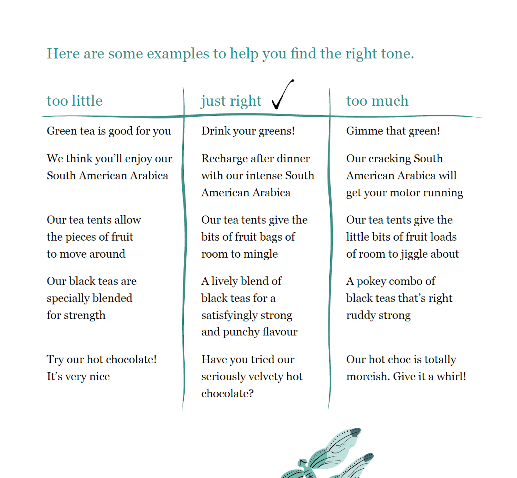
But as the world of tea and infusions grew busier and competitors began to catch up, the brief evolved – opening up opportunities to bring a little more wit into the language, particularly on pack.
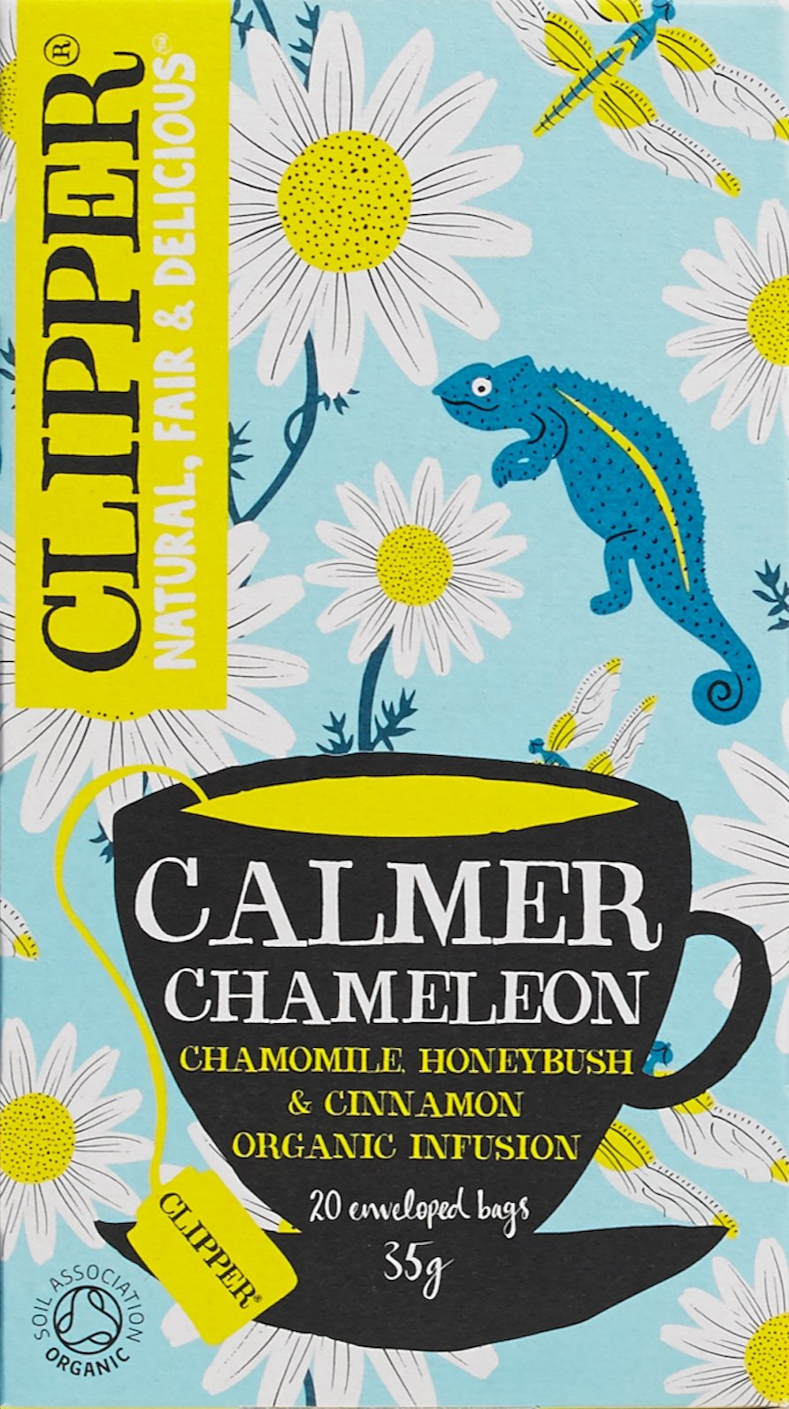
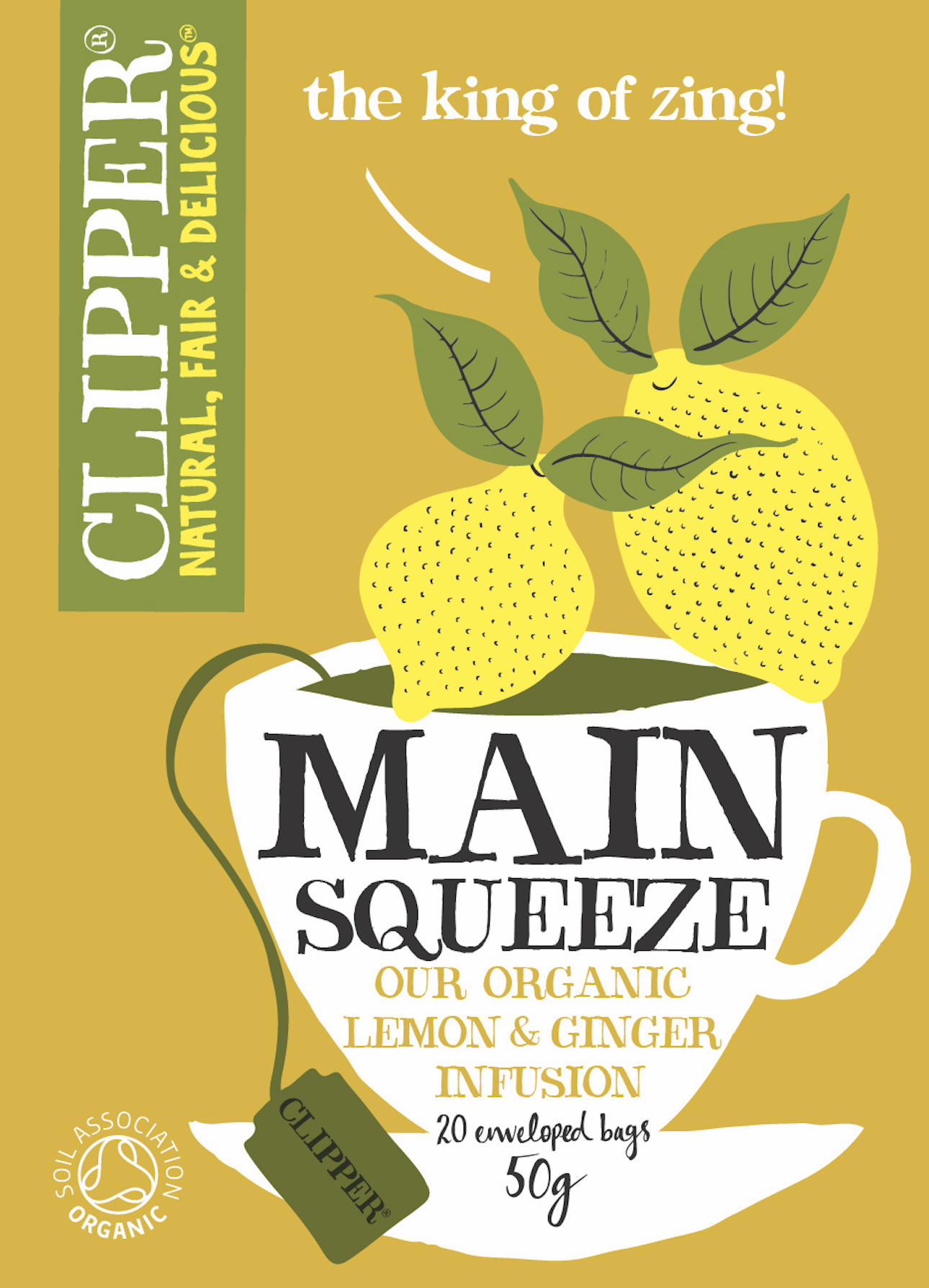
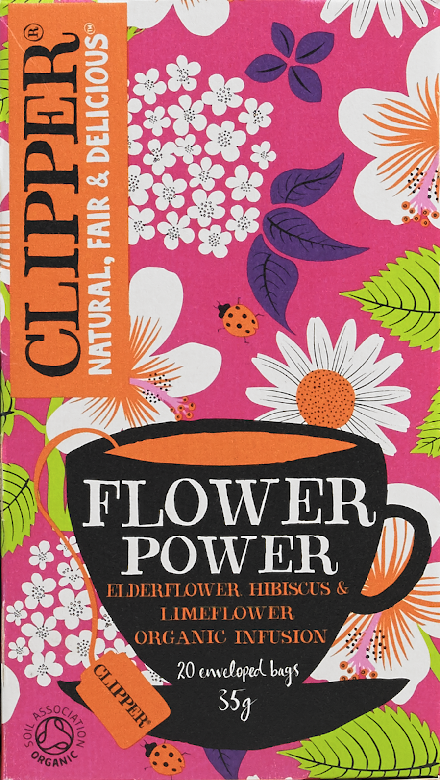
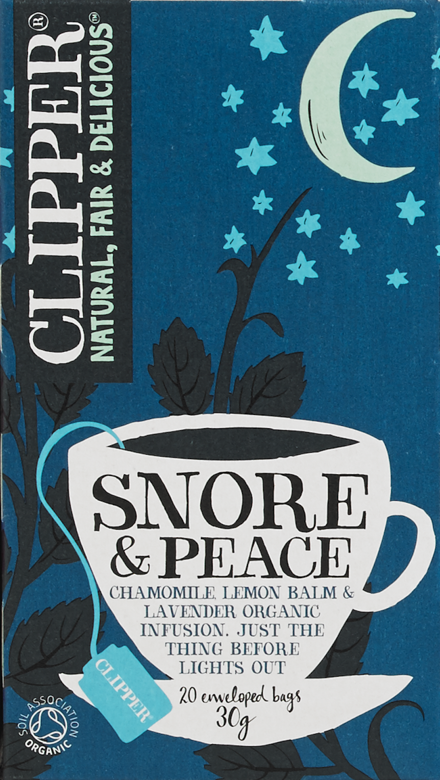
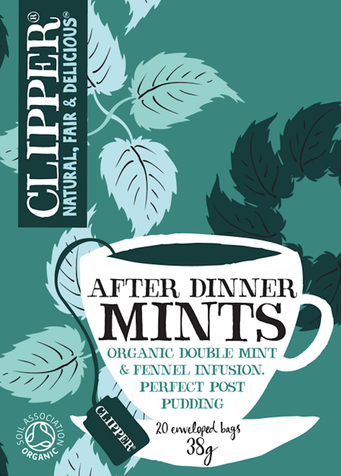
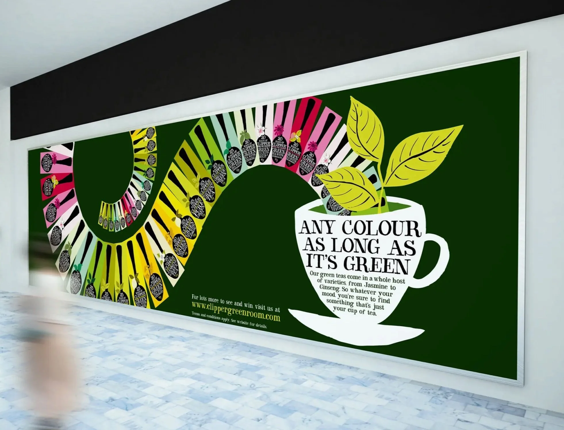
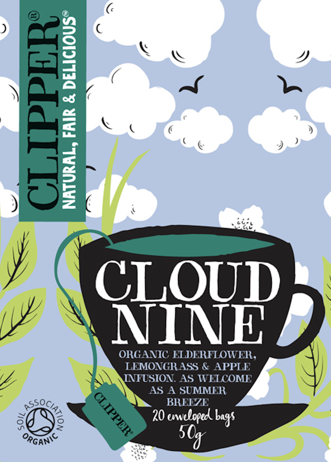
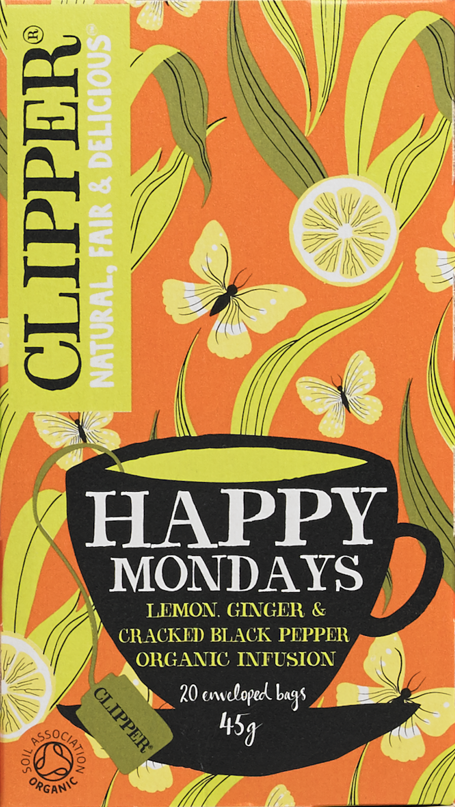
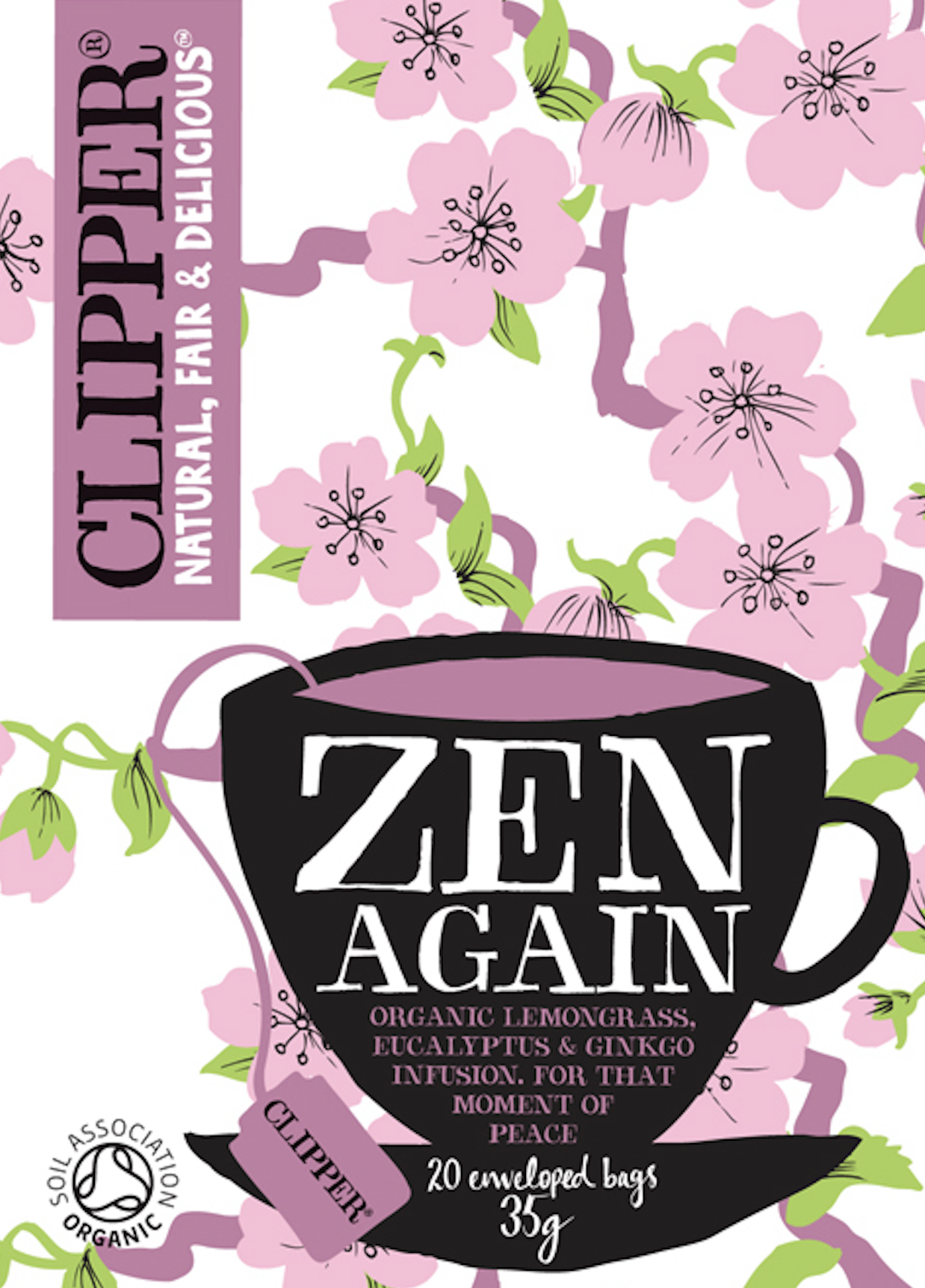
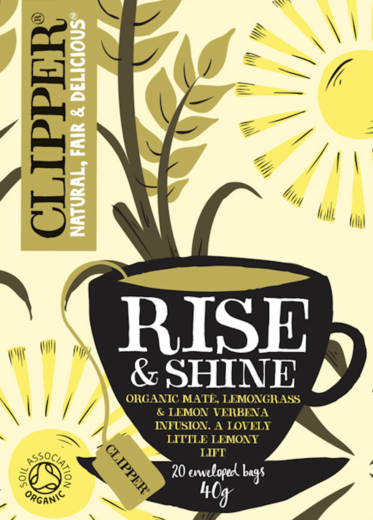
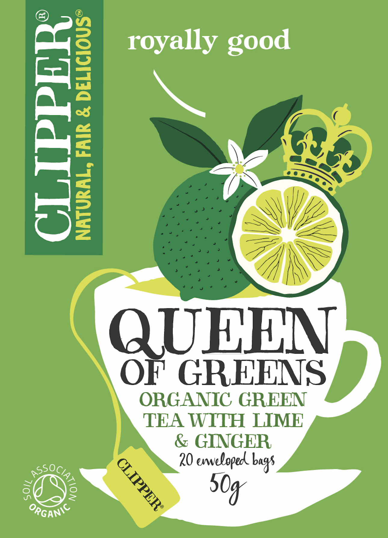
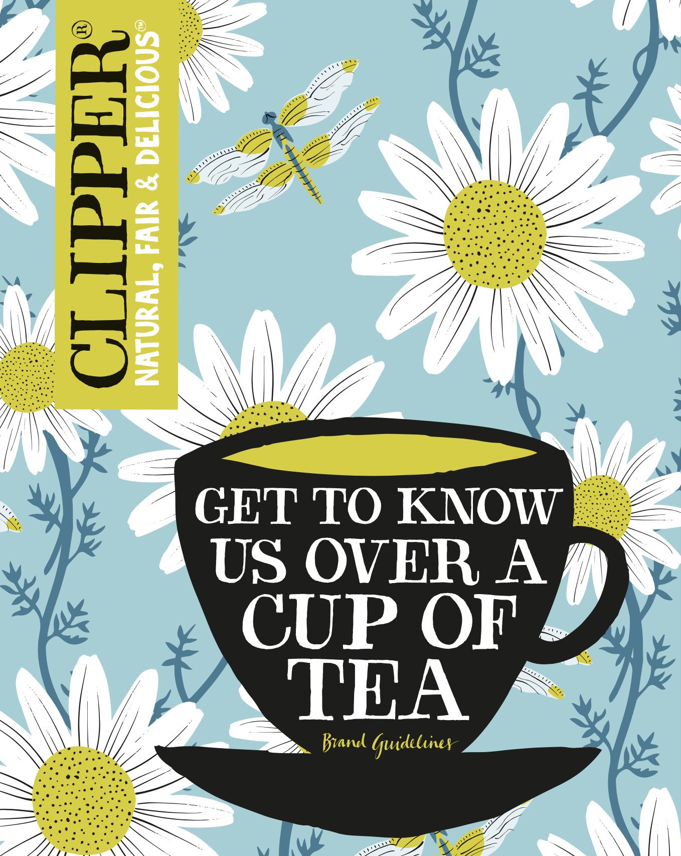
Over the next eight years, I wrote copy for packaging, press ads and brand guidelines, and came up with product names for a growing range of blends – many built around drinking occasions or specific benefits.
The aim was simple enough: add more personality, surprise and shelf standout, while staying true to Clipper’s integrity and principles.
Brand language | Product naming | Press ads | Pack copy | Brand guidelines
Design: big fish®
Tap below for zoomy zoomy.