Dorset Cereals
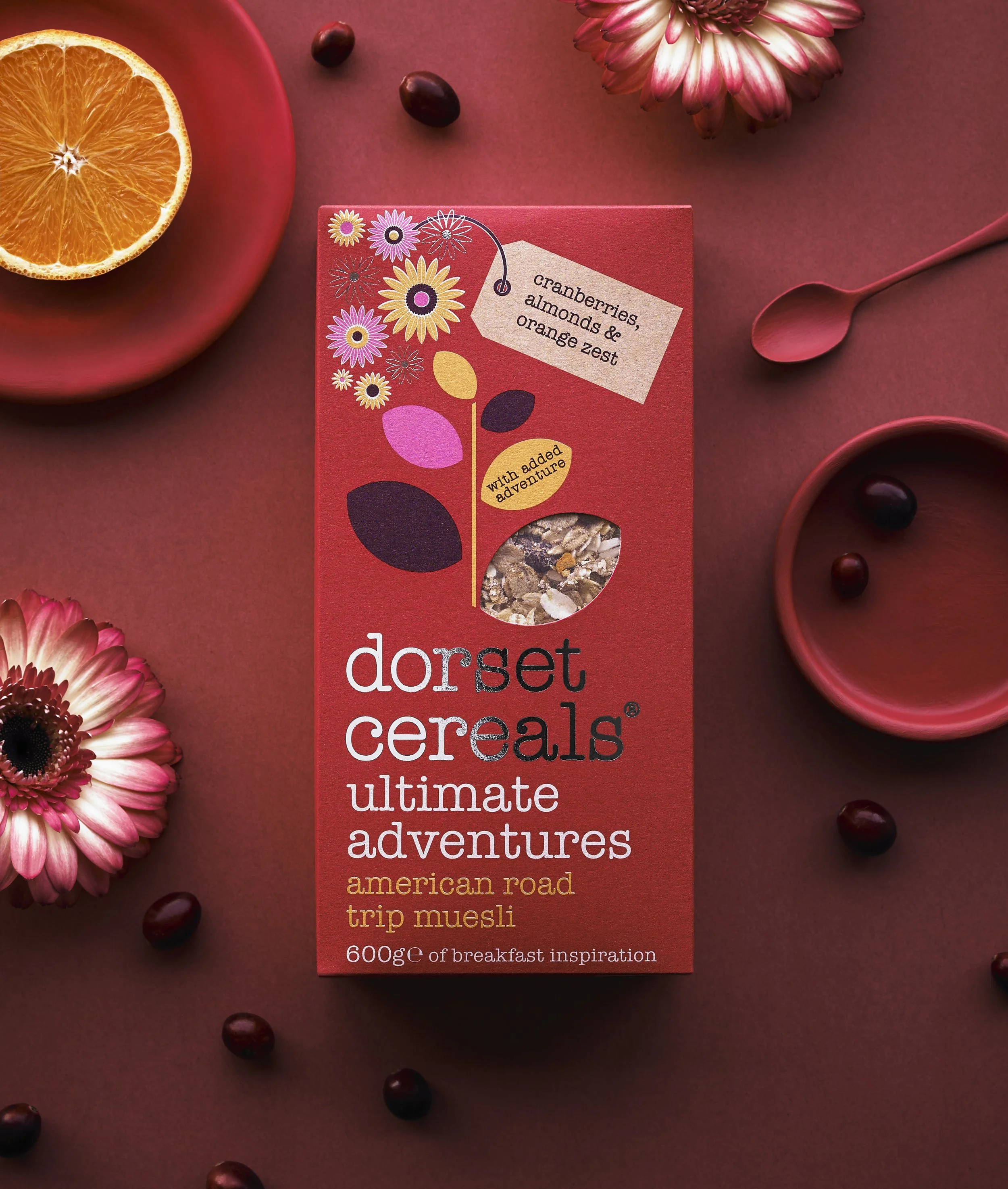
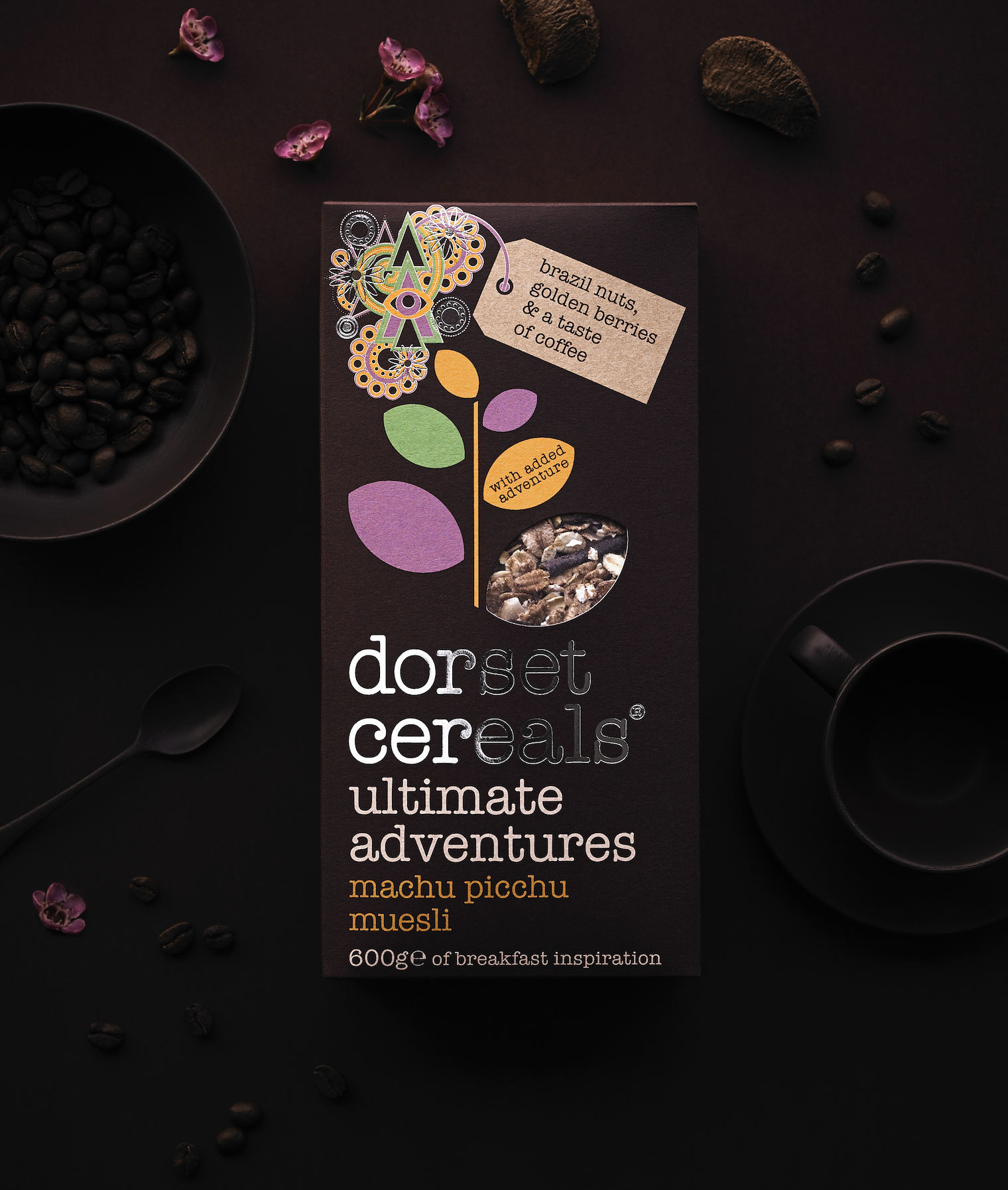
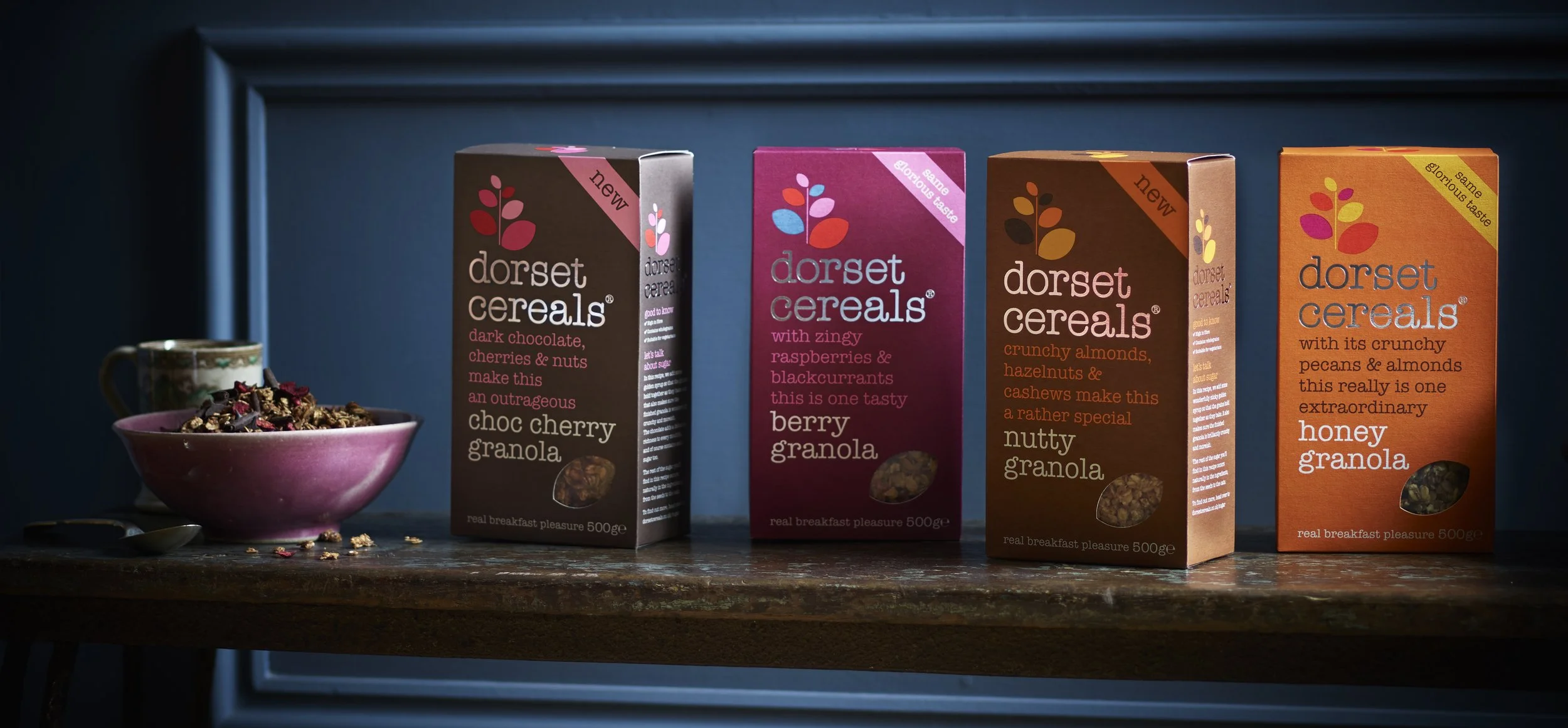
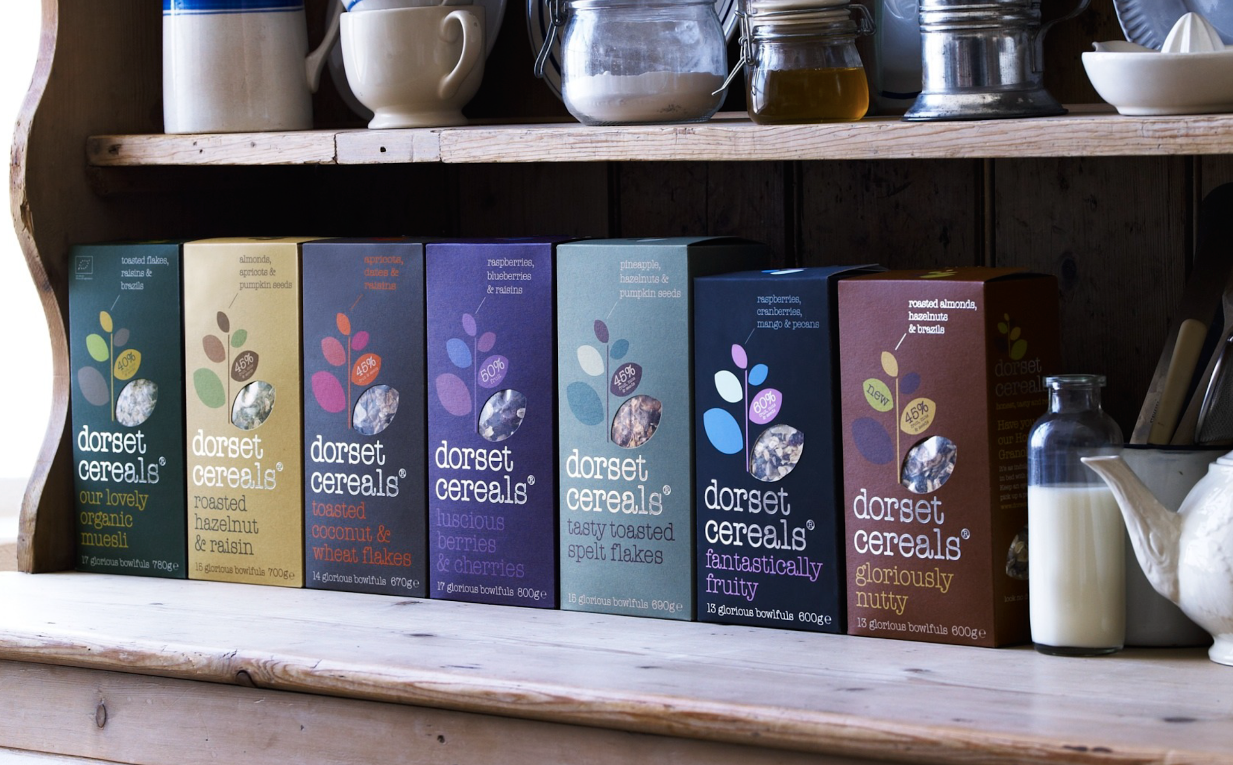
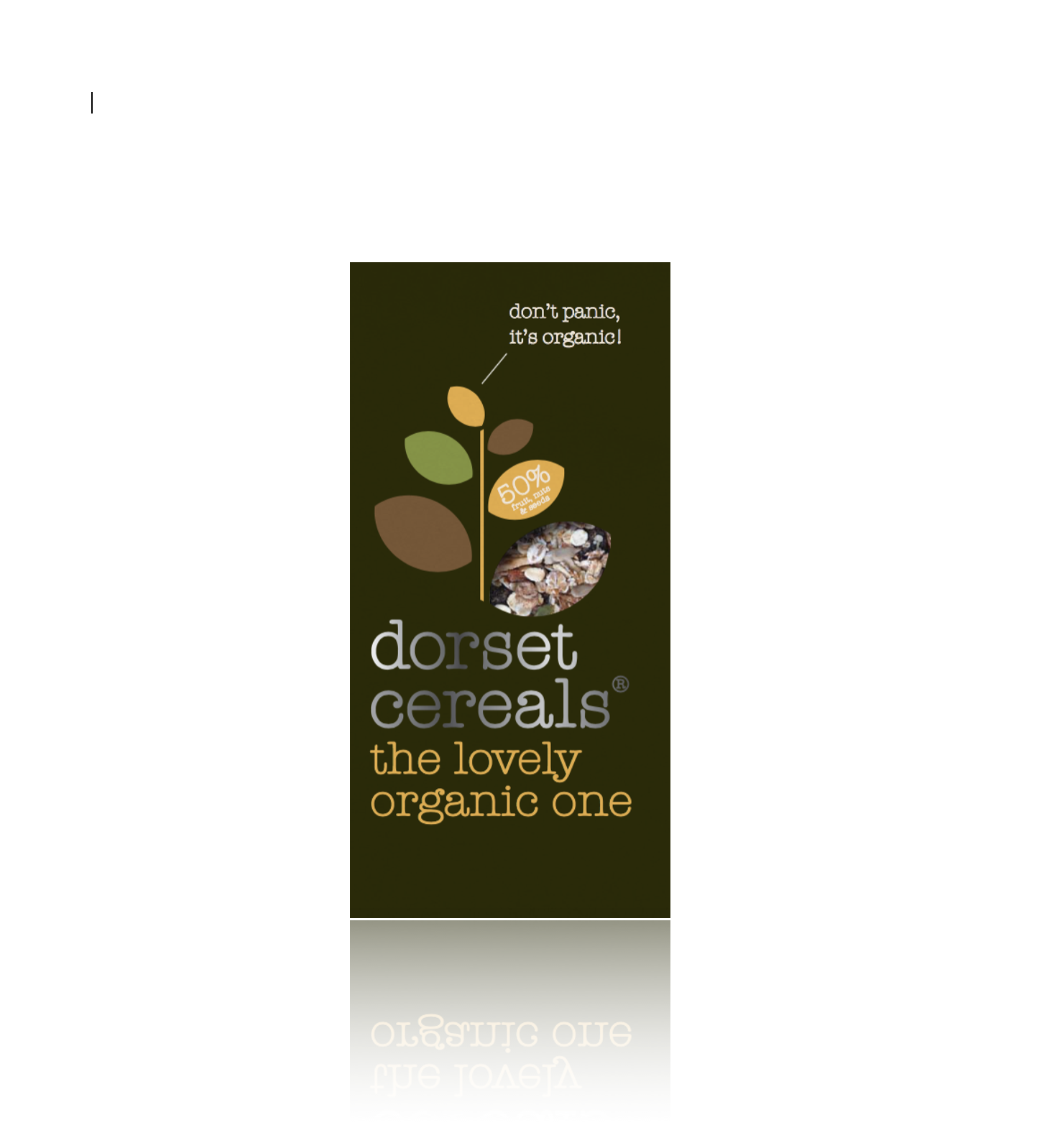
Dorset Cereals was the reason I took the Head of Words job at big fish®. Those beautiful packs, with their hushed Farrow & Ball hues, rewrote the rulebook.
In 2005, cereal boxes were big, brash and shouty, all primary colours and shiny cardboard. Legendary big fish® design director Vicky Sawdon decided to do the exact opposite, and the result was a design scheme that whispered at the consumer, seductively (and changed the way breakfast cereals looked forever).
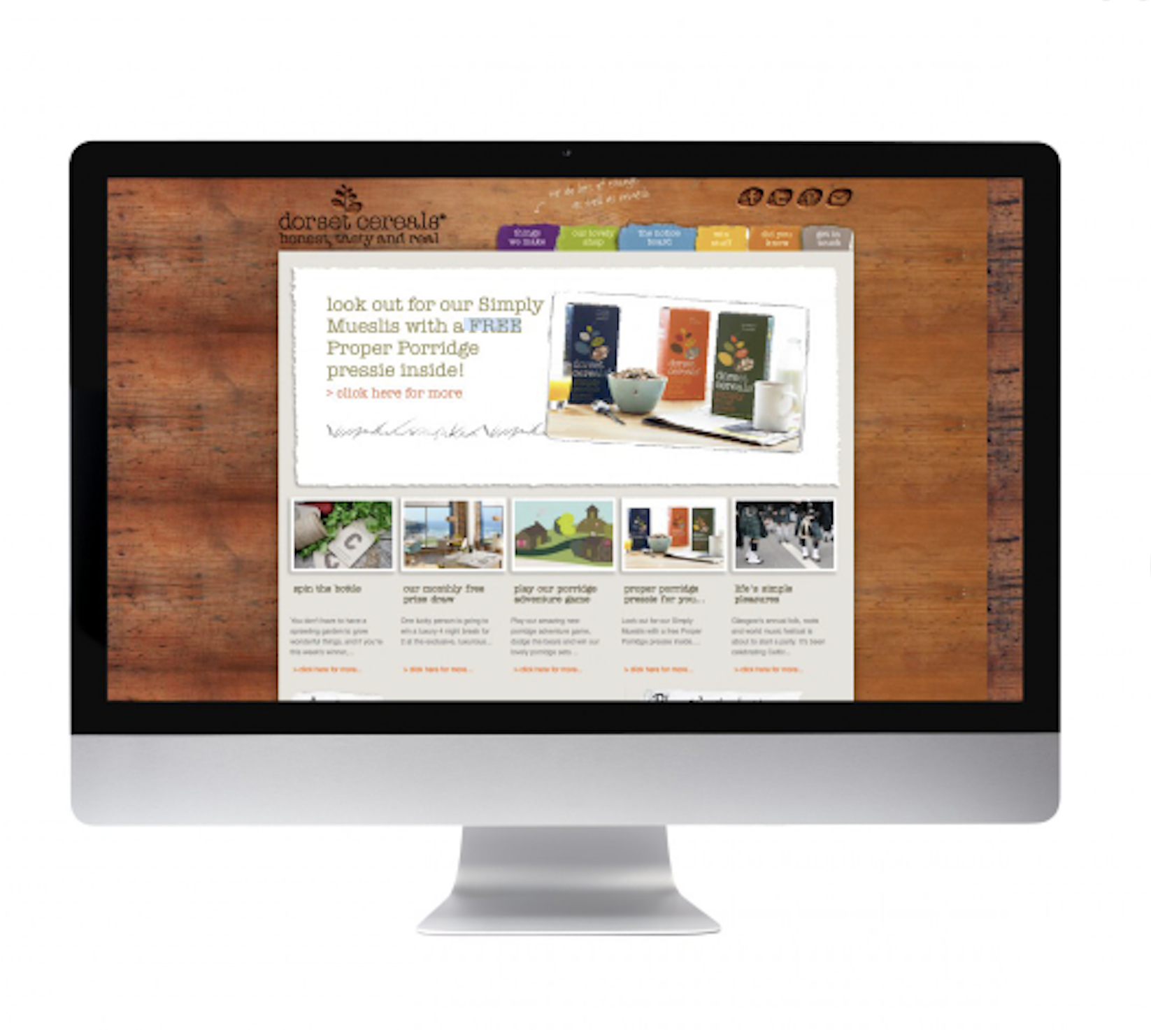
When I joined the team in 2009, I was lucky enough to take on the role of writer for DC, handling all their pack copy, web words and emailers.
I went on to work on subsequent updates of the brand, helping with strategy, product naming and evolving the tone of voice.
Brand strategy | Tone of voice | Product naming | Copywriting
Design: big fish®
Tap below to zoom in.